Why your hero section is everything
The hero section is the first thing people see when they land on your site. For most SaaS businesses, it's the most viewed part of the entire website. Whether users stay and scroll or bounce after two seconds often comes down to what happens above the fold.
This is your one shot to answer two critical questions:
- Is this for me?
- Does it solve a problem I care about?
Get this right, and users will explore your product, sign up for a demo, or remember your brand. Get it wrong, and... well, they're gone.
5 common mistakes that kill your hero section
1. The Wall of Text
You want to say everything and end up saying nothing.
Bloated copy, multiple messages, nested buzzwords: all of it overwhelms the visitor. Keep it short, scannable, and focused on a single idea. If you can't say what your product does in one line, you probably haven't clarified your positioning yet.
Fix: Write like a human. One sentence for what you do, one for why it matters. The rest can wait.
2. Marketing Fluff & Weak Copy
"Empowering growth through scalable synergy"?
Don't do it. Users need clarity. They want to know what problem you solve.
Fix: Replace vague claims with specifics. Use metrics, real-world outcomes, or pain points you solve. Show you understand your audience.
3. No Social Proof or Trust Markers
Even great products are ignored if users don't trust them. No logos, no reviews, no numbers? That's a red flag.
Fix: Add recognizable brand logos, testimonials, G2/Trustpilot badges, or usage stats. Show that others already trust you.
4. No Visual Hook or Supporting Element
A wall of text with nothing else? Not enough. You need a visual that supports your message, shows the product, or sparks emotion.
Fix: Use a high-quality product screenshot, short demo video, or illustration that reinforces your core value. Make it feel real.
5. No Call to Action
Some users are ready to sign up right away — but many SaaS hero sections don't even include a button. That's a missed opportunity.
Fix: Add a primary CTA above the fold (e.g. "Start free trial," "Book a demo") and a secondary if needed. Be clear on what that button click does.
3 SaaS Hero Sections That Get It Right
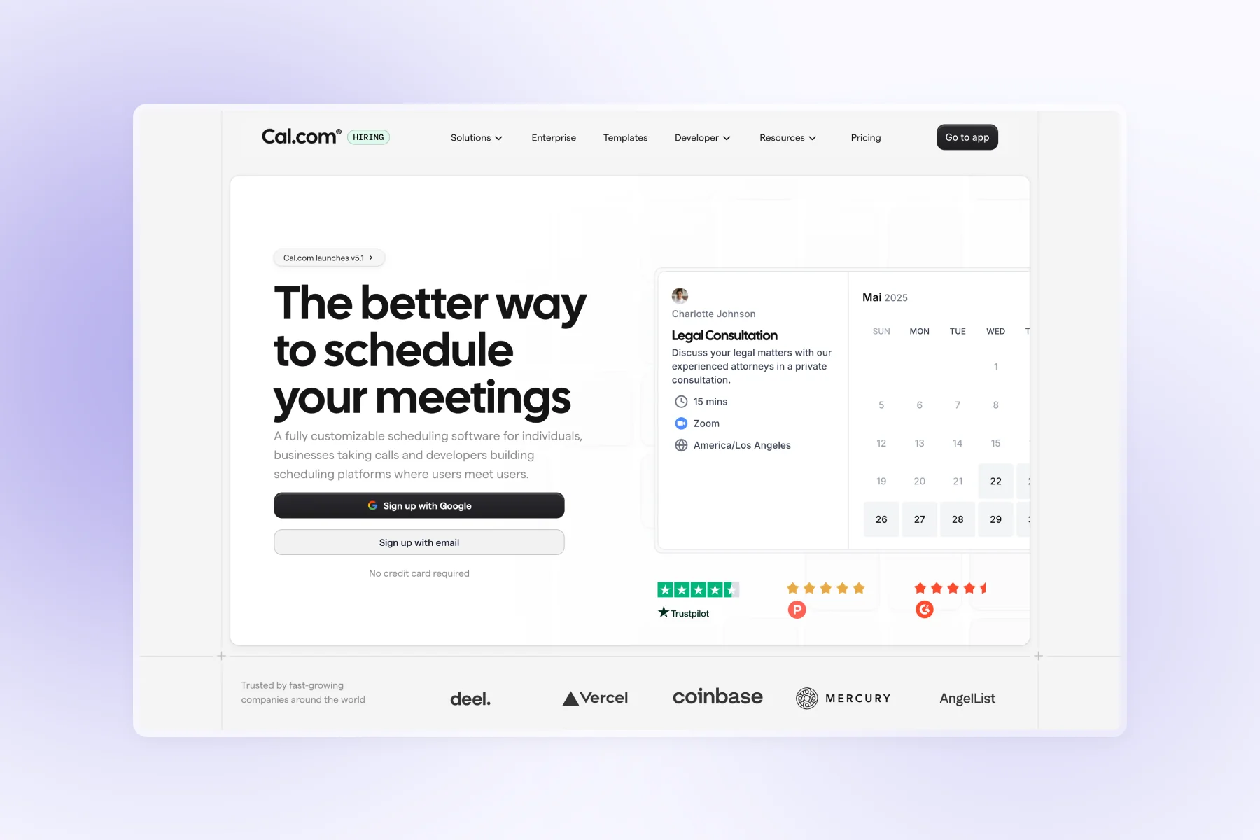
Cal.com
Their headline cuts straight to the point. You know exactly what you're getting within seconds. Right underneath, they've loaded up on social proof: G2 badges, Trustpilot ratings, Product Hunt features, plus logos from recognizable companies. It builds trust fast.

The design stays out of the way. Clean, minimal, neutral colors. When everything else is quiet, your core message gets heard.
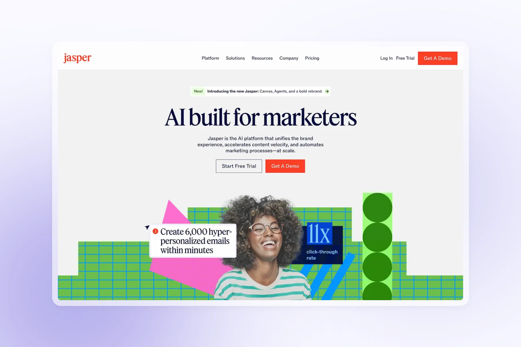
Jasper AI
"AI built for marketers" tells you everything. No guessing about fit or use case. If you're a marketer, this is for you.

They went bold with the visuals: bright colors, abstract shapes, but they balance it with an actual person in the shot. Keeps it human. They also lead with the specific result of "11x click-through rate" which gives you something concrete to latch onto.
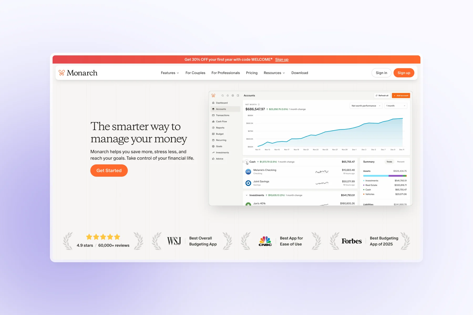
Monarch
They lean hard into credibility: 60,000+ users and media mentions from Forbes, WSJ, and CNBC. The numbers do the talking.

Their product demo runs right in the hero section, so you see the interface in action before you even scroll. Smart move. They've also got a discount banner running at the top which creates urgency without being pushy.
Want more examples like this?
We curate and break down real-world components from high-converting SaaS sites: hero sections, CTAs, testimonials, and more.